Beachside Restaurant
The architecture of a Malibu farm-to-table restaurant was designed to feel light and airy, with high ceilings and flooding natural light. Inspired by the brand’s food photography and proximity to the ocean, the interior design feels warm and inviting, like the dishes.
Translation of inspiration to interior
Inspiration Imagery
The balance of rich focal points with mellow backgrounds in the brand’s food photography inspired the use of color and pattern in the interior.
Image Sources (left to right):
Hello Glow “Comforting Curry”; Dianna “Jordskokkesuppe”; Virginie Gosselin and Anne Sylvestre “Nouvelles Tendances”
Architectural Interiors


Casual Dining Side. Diners can pick up take-out or place and order at the custom-designed counter, which flows from counter-to-bar height.

Restaurant Entry Design

Dining Room: Guests can sit around a circular open kitchen and watch the chefs prepare their delicious healthy meals. Curved niches provide cozy booth seating around the perimeter.

Birds-eye View. The design of the restaurant incorporates curves, such as circular counters, or arched dining booths, in keeping with the curved shapes of the brand's logo.
Waterfront Outdoor Dining Area Design. Violette at Omime Designs Interior Design
Floor Plan
The floor plan incorporates the brand’s logo, something guests may not notice at first glance, but will most likely realize as they move about the restaurant. Centering the design around two large open kitchens, in the shape of the letter “o”, makes the space feel flowing and open, while symbolizing the brand.
The restaurant is divided into two: the hostess-seated dining area is on the left side, and the casual self-seated area is on the right.
On the casual side, guests can order at the counter and then sit at the juice bar or on sofas along a curved wall. On the formal side, diners can watch chefs prepare their meals from the circular counter along the open kitchen, or sit with friends in semi-private curved nooks.
Clean Materials, Like the Recipes
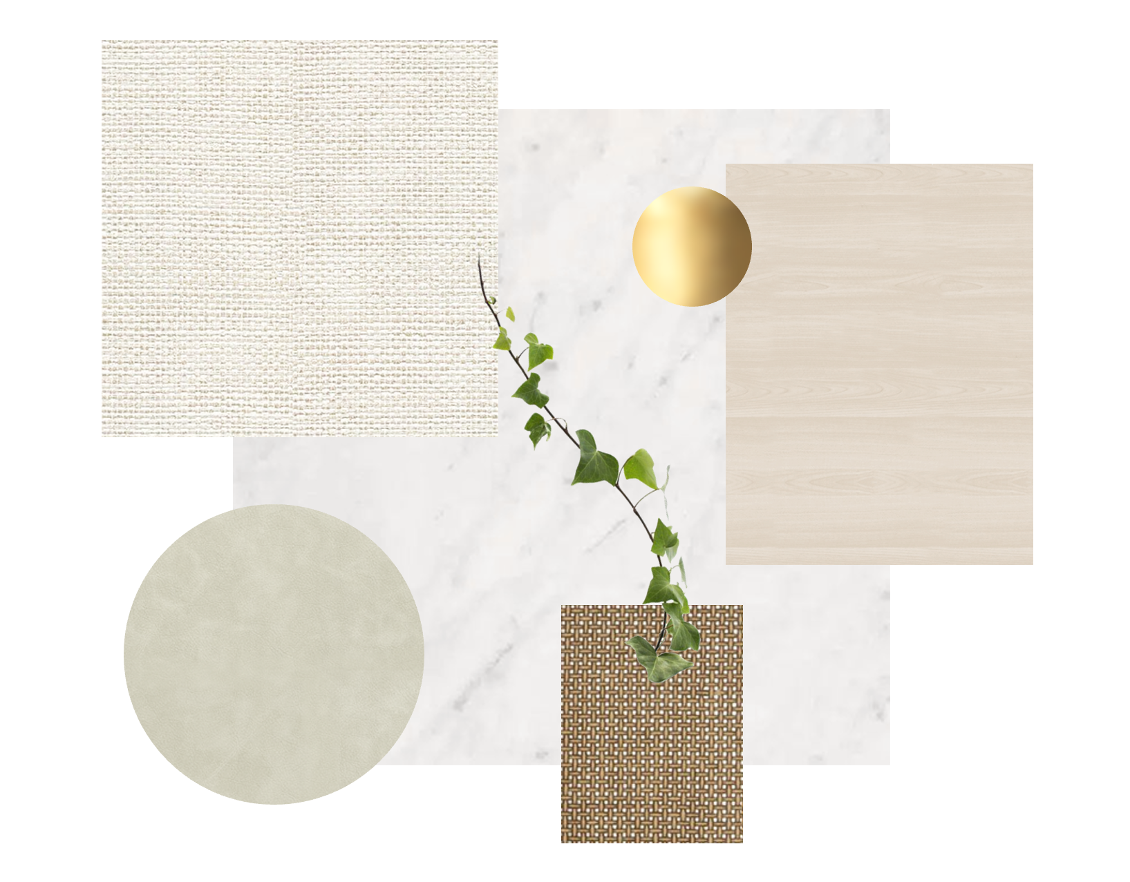
Semi-reflective and light-toned materials, such as polished marble floors and European white oak wood chairs make the space feel fresh and clean, just like the food served.
The brand’s focus on clean ingredients is paralleled by the materials in the restaurant which are sustainably-sourced, thus protecting the environment and human health.


